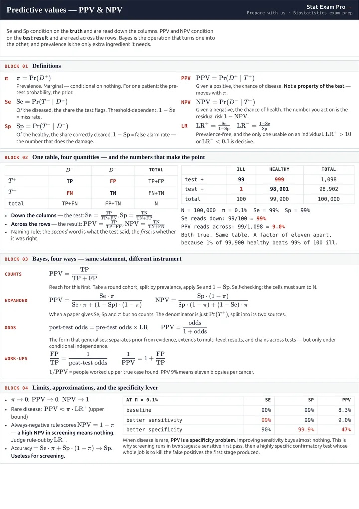
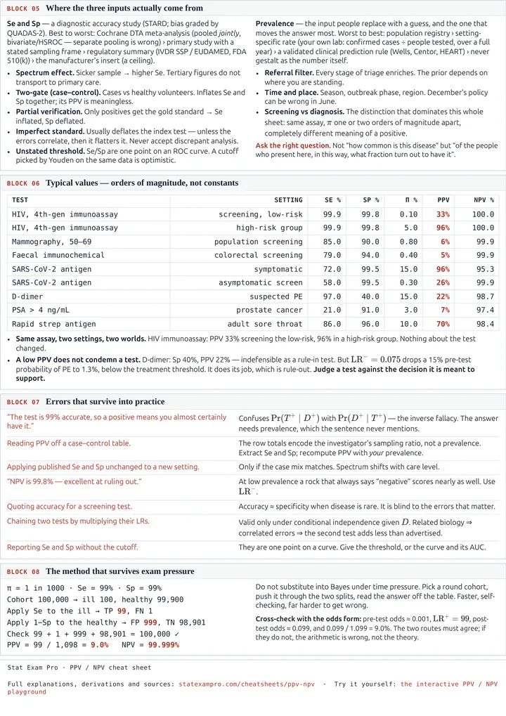
A reference sheet. Definitions as they are stated formally, then in plain terms; the derivation of
Bayes' theorem in this setting and the four equivalent ways to write the result; where sensitivity, specificity and
prevalence are actually obtained; typical values; and the errors that survive into practice. The collapsed blocks
expand into the background you need if a term is new.
1. Setup and notation
Fix a population. For each individual there are two binary variables. The first is the true disease status
$D$, taking the value $D^+$ if the disease is present and $D^-$ if it is absent. The second is the result of the
test under study, $T$, taking the value $T^+$ if the test is positive and $T^-$ if it is negative.
Two remarks about D, because everything downstream inherits them
First, $D$ is not observed directly. It is established by a reference standard — a biopsy, a culture, an
adjudicated clinical follow-up. When we say “the patient has the disease” we mean “the reference standard says
so”. If the reference standard is itself fallible, then $D$ as we have defined it is not the disease, and every
quantity below is being measured against the wrong target. Section 5 lists what to do about that.
Second, the population must be specified. There is no such thing as the sensitivity of a test in the abstract;
there is only its sensitivity in a stated population. That qualifier is doing far more work than it appears to,
and Section 5 is largely about why.
The pair $(D, T)$ has a joint distribution over four outcomes. Every quantity on this sheet is a
conditional probability computed from that joint distribution. There is nothing else going on.
What a joint distribution is, concretely
Two binary variables can land in four combinations, and the joint distribution is just the probability assigned
to each. Write them $a$, $b$, $c$, $d$:
| $D^+$ | $D^-$ |
|---|
| $T^+$ | $a = \Pr(D^+ \cap T^+)$ | $b = \Pr(D^- \cap T^+)$ |
|---|
| $T^-$ | $c = \Pr(D^+ \cap T^-)$ | $d = \Pr(D^- \cap T^-)$ |
|---|
The four numbers are non-negative and sum to 1. That is the entire probabilistic content of the problem, and
every quantity on this sheet is one of them divided by a sum of them:
$$\pi = a + c \qquad \mathrm{Se} = \frac{a}{a+c} \qquad \mathrm{Sp} = \frac{d}{b+d}
\qquad \mathrm{PPV} = \frac{a}{a+b} \qquad \mathrm{NPV} = \frac{d}{c+d}$$
Adding across one variable to be left with the other is called taking a marginal: $\pi = a + c$ is the
marginal probability of disease, obtained by not caring what the test said. Restricting to one row or column and
re-scaling it so that it sums to 1 is called conditioning. Sensitivity divides by a column, PPV divides by a
row. Same four numbers, different denominator — that single observation is most of this sheet.
2. The definitions
Prevalence $\pi$, $p$; also called the pre-test probability, or the prior
Definition
$$\pi \;=\; \Pr(D^+)$$
The marginal probability that an individual drawn from the specified population has the disease, as
determined by the reference standard. It is marginal — not conditional on any other event — and that is
exactly what separates it from the four conditional probabilities below. In terms of the joint distribution,
$\pi = \Pr(D^+ \cap T^+) + \Pr(D^+ \cap T^-)$.
When the same number is attached to one individual rather than to a population it is called
the pre-test probability, or the prior. It is the quantity Bayes' theorem requires in Section 4.
At a glance
- Typical: 0.01–1% in screening the asymptomatic; 5–50% in patients who present with symptoms
- Comes from: registries, local audit, or a clinical prediction rule (Section 6)
- Moves PPV? Yes, more than anything else does
- Moves Se and Sp? No — by assumption; see the box below
- Trap: the prevalence in the general population is not the prevalence among the people you are testing
Put plainly
How common the disease is among the people walking through your door. Not how common it is in the country,
and not how common it is in the textbook.
Applied to one patient rather than a population, the same number is your prior: how likely you thought
it was that this person is ill, before the test came back. Calling it a prevalence or a prior does not change the
arithmetic. It changes where you are entitled to get the number from.
Sensitivity $\mathrm{Se}$; true positive rate, TPR; in machine learning, recall
Definition
$$\mathrm{Se} \;=\; \Pr(T^+ \mid D^+)$$
The conditional probability that the test is positive, given that the disease is present; equivalently, the
proportion of diseased individuals in whom the test returns a positive result.
It is a property of the conditional law $\Pr(T \mid D)$ and so, under the modelling
assumption stated below, does not vary with prevalence. For a test with a continuous readout it is defined only
relative to a stated threshold. Its complement, $1 - \mathrm{Se} = \Pr(T^- \mid D^+)$, is the false negative
rate.
At a glance
- Typical: 70–99%. Tests designed to rule out are built to sit at the top of that range
- Comes from: a diagnostic accuracy study, single-gate design
- Set by the threshold? Yes — lower the cutoff and Se rises while Sp falls
- Complement: $1 - \mathrm{Se} = $ FNR, the miss rate
- Rule-out logic: a highly sensitive test, when negative, argues against disease
Put plainly
Of the people who really are ill, what fraction does the test catch?
Notice what is being held fixed: the disease, not the test result. Sensitivity describes what the test does to
a group you have already sorted by the truth. You can assemble that group in a study, where the reference
standard tells you who is ill. You cannot assemble it in a clinic, because in a clinic the truth is precisely
what you are trying to find out.
Specificity $\mathrm{Sp}$; true negative rate, TNR
Definition
$$\mathrm{Sp} \;=\; \Pr(T^- \mid D^-)$$
The conditional probability that the test is negative, given that the disease is absent; equivalently, the
proportion of non-diseased individuals correctly classified as negative.
Like sensitivity it is a property of the conditional law $\Pr(T \mid D)$, and for a
continuous readout it is defined only relative to a stated threshold. Its complement,
$1 - \mathrm{Sp} = \Pr(T^+ \mid D^-)$, is the false positive rate.
At a glance
- Typical: 90–99.9%. Confirmatory tests live at the top; D-dimer sits near 40%
- Comes from: the same accuracy study, same table
- Complement: $1 - \mathrm{Sp} = $ FPR, the false alarm rate — this is the number that does the damage
- At low prevalence: it, and not sensitivity, governs PPV (Section 7)
- Rule-in logic: a highly specific test, when positive, argues for disease
Put plainly
Of the people who are healthy, what fraction does the test correctly clear?
The half of it that matters is the other half: $1 - \mathrm{Sp}$, the false positive rate. That rate gets
applied to the healthy group — and when the disease is rare, the healthy group is very nearly everybody. A false
positive rate of 1% sounds negligible until you notice it is 1% of almost the entire population.
Positive predictive value $\mathrm{PPV}$; post-test probability of disease after a positive; in machine learning, precision
Definition
$$\mathrm{PPV} \;=\; \Pr(D^+ \mid T^+)$$
The conditional probability that the disease is present, given that the test returned a positive result;
equivalently, the proportion of test-positive individuals who are diseased. It is the posterior
probability of disease after a positive, obtained from $\pi$, $\mathrm{Se}$ and $\mathrm{Sp}$ by Bayes'
theorem.
It is not a property of the test. It is a property of the test together with the
population it was applied to, and it moves with $\pi$ even when $\mathrm{Se}$ and $\mathrm{Sp}$ are held
fixed.
At a glance
- Typical: 5–10% in low-prevalence screening; 70–95% in symptomatic patients
- Comes from: computed from Se, Sp and $\pi$ — not measured, unless the study was single-gate
- Moves with prevalence? Yes. It is not a property of the test
- Useful form: $1/\mathrm{PPV}$ is the number of work-ups per true case found
- Trap: a PPV read straight off a case–control table is meaningless (Section 9)
Put plainly
The result came back positive. What is the chance this person actually has the disease?
This is the question the patient is asking, and the conditioning has flipped to answer it: we now condition on
the test result, which is the thing you can actually see, rather than on the disease status, which is the thing
you cannot. The price of that flip is that the answer is no longer a property of the test alone. It depends on
who was tested, through $\pi$.
Negative predictive value $\mathrm{NPV}$
Definition
$$\mathrm{NPV} \;=\; \Pr(D^- \mid T^-) \;=\; 1 - \Pr(D^+ \mid T^-)$$
The conditional probability that the disease is absent, given that the test returned a negative result;
equivalently, the proportion of test-negative individuals who are free of disease.
Its complement, $1 - \mathrm{NPV} = \Pr(D^+ \mid T^-)$, is the posterior probability of
disease after a negative — the residual risk — and that, not NPV itself, is the quantity a clinician acts
on when ruling a diagnosis out. Like PPV, it depends on the prevalence.
At a glance
- Typical: above 99% whenever the disease is rare — which makes it nearly uninformative there
- The number you actually want: the residual risk $1 - \mathrm{NPV} = \Pr(D^+ \mid T^-)$
- Moves with prevalence? Yes, in the opposite direction to PPV
- Benchmark: a rule that reports “negative” for everyone already attains $\mathrm{NPV} = 1 - \pi$
- Judge rule-out by: $\mathrm{LR}^-$ or sensitivity, neither of which contains $\pi$
Put plainly
The result came back negative. What is the chance this person is genuinely clear?
Keep the second equality in view. When you are ruling a diagnosis out, the quantity you care about is the risk
that remains — $\Pr(D^+ \mid T^-)$ — and that is $1 - \mathrm{NPV}$, not NPV itself. An NPV of 99% and a residual
risk of 1% are the same sentence, but only one of them sounds like something you should act on.
Likelihood ratios $\mathrm{LR}^+$, $\mathrm{LR}^-$; the Bayes factor of a result
Definition
$$\begin{aligned}
\mathrm{LR}^{+} &= \frac{\Pr(T^+ \mid D^+)}{\Pr(T^+ \mid D^-)} = \frac{\mathrm{Se}}{1 - \mathrm{Sp}} \\[6pt]
\mathrm{LR}^{-} &= \frac{\Pr(T^- \mid D^+)}{\Pr(T^- \mid D^-)} = \frac{1 - \mathrm{Se}}{\mathrm{Sp}}
\end{aligned}$$
For a result $t$, the likelihood ratio is $\Pr(T = t \mid D^+) \,/\, \Pr(T = t \mid D^-)$: the ratio of the
probabilities of observing that result under the two disease hypotheses.
It is a function of the conditional law $\Pr(T \mid D)$ alone and therefore contains no
prevalence. By Bayes' theorem in odds form (Section 4, Form 3) it is the multiplicative factor that converts
pre-test odds into post-test odds; in Bayesian terminology it is the Bayes factor of the result.
At a glance
- $\mathrm{LR}^+$: above 10 decisive · 5–10 moderate · 2–5 weak · 1 worthless
- $\mathrm{LR}^-$: below 0.1 decisive · 0.1–0.2 moderate · above 0.5 weak
- Contains prevalence? No. This is why it transports between settings
- How it is used: it multiplies the odds of disease (Section 4, Form 3)
- Chains across tests? Yes — but only under conditional independence
Put plainly
How much better does “this person is ill” explain the result you just got, than “this person is healthy”
does? An $\mathrm{LR}^+$ of 99 means a positive result is 99 times more common among the ill than among the
healthy.
This is the only quantity on the sheet that is both free of prevalence — so you may take it from a published
study — and directly applicable to the individual in front of you. Section 4 shows why: it acts by multiplication
on the odds.
The structural point
Sensitivity and specificity condition on $D$. Predictive values condition on $T$.
What “condition on” means, and why the direction cannot be reversed
The conditional probability of $A$ given $B$ is defined as
$$\Pr(A \mid B) \;=\; \frac{\Pr(A \cap B)}{\Pr(B)}, \qquad \Pr(B) > 0.$$
Operationally: throw away everybody for whom $B$ is false, and re-scale what is left so the probabilities sum
to 1 again. “Conditioning on $D^+$” means discarding the healthy and looking only at the diseased column of the
table. “Conditioning on $T^+$” means discarding everyone who tested negative and looking only at the positive row.
The four cells never change. What changes is the denominator you divide by.
So $\Pr(T^+ \mid D^+)$ and $\Pr(D^+ \mid T^+)$ are computed from the same table with different denominators, and
in general they are nowhere near each other. The worked example in Section 10 makes this concrete: there,
$\Pr(T^+ \mid D^+) = 99\%$ and $\Pr(D^+ \mid T^+) = 9\%$. Same test, same patients, same four numbers. Treating
those two as interchangeable is the single most common error in this material; in a legal setting the same mistake
has its own name, the prosecutor's fallacy.
The two are not unrelated, of course. Multiply both sides of the definition by $\Pr(B)$ and you get
$\Pr(A \cap B) = \Pr(A \mid B)\Pr(B) = \Pr(B \mid A)\Pr(A)$, and rearranging gives Bayes' theorem. Reversing the
conditioning is exactly what Bayes' theorem does, and the extra ingredient it demands is the marginal $\Pr(D^+)$ —
the prevalence.
There is no general reason for $\Pr(T^+ \mid D^+)$ and $\Pr(D^+ \mid T^+)$ to be close to one another.
Converting one into the other requires the prevalence, and that conversion is the content of Section 4.
An assumption, not a theorem
It is standard to say that sensitivity and specificity are properties of the test and do not
depend on prevalence, whereas predictive values do. What that statement really asserts is that the conditional law
$\Pr(T \mid D)$ is stable across populations while the marginal $\Pr(D)$ varies. That is a modelling assumption. It
is the assumption that licenses you to take $\mathrm{Se}$ and $\mathrm{Sp}$ from a published study and apply them in
your own clinic, so it is doing a great deal of work. It is also, in practice, false to a degree that matters — see
the spectrum effect in Section 5.
3. The contingency table
Apply the test to $N$ individuals and classify each by the reference standard and by the test. The counts fall
into four cells.
| $D^+$ | $D^-$ | Row total |
|---|
| $T^+$ | $\mathrm{TP}$ | $\mathrm{FP}$ | $\mathrm{TP} + \mathrm{FP}$ |
|---|
| $T^-$ | $\mathrm{FN}$ | $\mathrm{TN}$ | $\mathrm{FN} + \mathrm{TN}$ |
|---|
| Column total | $\mathrm{TP} + \mathrm{FN}$ | $\mathrm{FP} + \mathrm{TN}$ | $N$ |
|---|
How to read this table, how the four cells are named, and a filled-in example
The term contingency table is Karl Pearson's, from 1904; the 2×2 case is the smallest one there is, and
it is the object on which the whole of diagnostic testing sits.
The names of the four cells follow one rule, and once you have it you will not mix them up again. The second
word says what the test reported. The first word says whether the test was right. So:
TP, true positive — the test said positive, and the test was right. The person is ill.
FP, false positive — the test said positive, and the test was wrong. The person is healthy. A false alarm.
FN, false negative — the test said negative, and the test was wrong. The person is ill and has been missed.
TN, true negative — the test said negative, and the test was right. The person is healthy.
Note what “false positive” does not mean: it does not mean the person is positive for something false. It
means the test result was positive and that result was false. Half the confusion in this subject comes from
reading those two words in the wrong order.
Here is the table filled in with the cohort worked in Section 10 — 100,000 people, prevalence 1 in 1000, a test
that is 99% sensitive and 99% specific:
| $D^+$ (ill) | $D^-$ (healthy) | Row total |
|---|
| $T^+$ | 99 | 999 | 1,098 |
|---|
| $T^-$ | 1 | 98,901 | 98,902 |
|---|
| Column total | 100 | 99,900 | 100,000 |
|---|
Read sensitivity down the first column: $99/100 = 99\%$. Read PPV across the first row:
$99/1{,}098 = 9.0\%$. Both numbers are true, both describe this table, and they differ by a factor of eleven. The
999 false positives are only 1% of the healthy — but the healthy are 99.9% of everybody, and 1% of a very large
number beats 99% of a very small one.
The natural estimators are the corresponding sample proportions, which are also the maximum likelihood
estimators under the sampling schemes discussed in Section 9:
$$\widehat{\mathrm{Se}} = \frac{\mathrm{TP}}{\mathrm{TP} + \mathrm{FN}}
\qquad \widehat{\mathrm{Sp}} = \frac{\mathrm{TN}}{\mathrm{TN} + \mathrm{FP}}
\qquad \widehat{\mathrm{PPV}} = \frac{\mathrm{TP}}{\mathrm{TP} + \mathrm{FP}}
\qquad \widehat{\mathrm{NPV}} = \frac{\mathrm{TN}}{\mathrm{TN} + \mathrm{FN}}$$
What an estimator is, and why it wears a hat
The quantities in Section 2 — $\mathrm{Se}$, $\mathrm{Sp}$, $\pi$ — are properties of the population. They are
fixed numbers, and you do not know them. What you have instead is a sample, and a rule for turning that sample into
a guess. That rule is the estimator, and the hat marks it: $\widehat{\mathrm{Se}}$ is not the sensitivity, it
is our guess at the sensitivity, computed from data.
The distinction that matters, and that is worth being pedantic about: an estimator is a function of the
data, and since the data are random, the estimator is itself a random variable. An estimate is the number
you get once you plug in the sample you actually collected. $\widehat{\mathrm{Se}} = \mathrm{TP}/(\mathrm{TP} +
\mathrm{FN})$ is an estimator; $0.99$ is an estimate. Run the study again on a fresh sample of patients and the
estimate will come out somewhere else, while the estimator is the same rule throughout.
Two things are therefore wanted of an estimator, and they are different things. It should be centred on the
truth — that is bias. And it should not jump around much from sample to sample — that is variance. An
estimator can be perfectly stable and perfectly useless: the rule “report 90% regardless of the data” has zero
variance and is not, in general, anywhere near the right answer.
The sample proportions above are unbiased, and they are the maximum likelihood estimators for a binomial count.
Their variance is what Section 9 is about, and it is why a point estimate on its own is not a finished answer — it
needs an interval around it.
Sensitivity and specificity have the column totals in their denominators; the predictive values have the row
totals. This is the same statement as before — conditioning on $D$ against conditioning on $T$ — now visible as
which margin you divide by. Prevalence is estimated by $\widehat{\pi} = (\mathrm{TP} + \mathrm{FN}) / N$, and that
estimate is meaningful only if the sample was assembled without reference to disease status. Section 9 returns to
this, because it is the point at which a great many published tables are misread.
4. Bayes' theorem, and four ways to write the answer
By the definition of conditional probability,
$$\Pr(D^+ \mid T^+) \;=\; \frac{\Pr(T^+ \mid D^+)\cdot\Pr(D^+)}{\Pr(T^+)}.$$
The denominator is not given directly, but a positive test can arise in exactly two mutually exclusive ways: the
individual is diseased and tests positive, or is not diseased and tests positive anyway. By the law of total
probability,
$$\Pr(T^+) \;=\; \Pr(T^+ \mid D^+)\cdot\Pr(D^+) \;+\; \Pr(T^+ \mid D^-)\cdot\Pr(D^-)
\;=\; \mathrm{Se} \cdot \pi \;+\; (1-\mathrm{Sp}) \cdot (1-\pi).$$
Substituting gives the standard expression, and the same argument with the roles of $T^+$ and $T^-$ exchanged
gives NPV.
This is the form to use when a paper hands you $\mathrm{Se}$, $\mathrm{Sp}$ and a prevalence but no counts. The
denominator is the total positive rate, split into its two sources; the numerator is the first of those two terms.
Written that way the formula does not have to be memorised, because it can be reconstructed from the table.
Algebraically this is the same statement: multiply numerator and denominator of Form 1 by $N$ and the
probabilities turn into expected counts. Practically it is a different instrument. If you take a round cohort,
split it by prevalence, and apply $\mathrm{Se}$ and $1 - \mathrm{Sp}$ to the two halves, you obtain the four cells
and read the answer off directly. The arithmetic is elementary and it checks itself, since the cells must sum to
$N$. Under exam conditions this route produces fewer errors than substitution into Form 1, and it is the method
worked in Section 10.
Odds, and likelihood: the two words this form is built from
Odds. A probability and an odds carry the same information in different coordinates. If an event has
probability $p$, its odds are
$$o \;=\; \frac{p}{1-p}, \qquad\text{and back again}\qquad p \;=\; \frac{o}{1+o}.$$
A probability of $0.5$ is odds of $1$ — “evens”. A probability of $0.9$ is odds of $9$, usually spoken as
“9 to 1 on”. A probability of $0.001$ is odds of about $0.001$; when $p$ is small, $p$ and $o$ are nearly equal,
which is worth knowing because it makes the rare-disease arithmetic easy. Probabilities are bounded above by 1 and
so cannot simply be multiplied by evidence; odds run from $0$ to $\infty$ and can be. That is the whole reason for
changing coordinates.
Likelihood. A probability is read forwards: fix the hypothesis, ask how probable the data are. A
likelihood is that same number read backwards: fix the data you actually observed, and read $\Pr(\text{data} \mid
\text{hypothesis})$ as a function of the hypothesis. It measures how well each hypothesis accounts for what you
saw. It is not a probability distribution over hypotheses and does not sum to 1.
Here there are exactly two hypotheses, $D^+$ and $D^-$, and one observation, the test result. The
likelihood ratio compares how well the two hypotheses account for it:
$$\mathrm{LR}^+ = \frac{\Pr(T^+ \mid D^+)}{\Pr(T^+ \mid D^-)}
= \frac{\text{how often a positive turns up in the ill}}{\text{how often a positive turns up in the healthy}}$$
If $\mathrm{Se} = 99\%$ and $\mathrm{Sp} = 99\%$, then $\mathrm{LR}^+ = 0.99/0.01 = 99$: a positive result is 99
times more common among the ill. That single number is the entire evidential content of the result, and Bayes'
theorem in odds form says you get the answer by multiplying your prior odds by it. Starting from a prevalence of 1
in 1000 — prior odds about $0.001$ — the posterior odds are $0.001 \times 99 \approx 0.099$, and converting back,
$0.099 / 1.099 = 9\%$. In Bayesian terminology the likelihood ratio is the Bayes factor; the two words name
the same object.
The derivation is one line: write Bayes' theorem for $\Pr(D^+ \mid T^+)$ and for $\Pr(D^- \mid T^+)$ and divide
the two. The common denominator $\Pr(T^+)$ cancels, which is precisely why the odds form avoids ever having to
compute it. Recover the probability at the end with $\mathrm{PPV} = \mathrm{odds} / (1 + \mathrm{odds})$, and for a
negative result apply the same identity with $\mathrm{LR}^-$ to obtain $\Pr(D^+ \mid T^-)$, from which
$\mathrm{NPV} = 1 - \Pr(D^+ \mid T^-)$.
Three reasons this form is worth the extra step. It separates the prior from the evidence: the likelihood ratio
is a property of the test and carries no prevalence, so it is the part you are entitled to transport from a study.
It extends beyond binary results: a continuous assay has a likelihood ratio for each band of values, so you are not
forced to collapse a measurement into “positive”. And it composes: for two tests,
$\text{post-odds} = \text{pre-odds} \times \mathrm{LR}_1 \times \mathrm{LR}_2$ — but only if the two results are
conditionally independent given $D$, an assumption that is routinely made and routinely false for tests that
interrogate related biology, in which case the second test contributes less than its likelihood ratio advertises.
The same information, expressed as a count rather than a probability. $1/\mathrm{PPV}$ is the number of
individuals who must be worked up — biopsied, imaged, confirmed — for each true case found. A PPV of 9% means
eleven work-ups per case. When the question is not “how likely is this patient to be ill” but “what will this
screening programme cost and how much harm will it do”, this is the form that answers it.
Limiting behaviour and approximations
Let $\pi \to 0$ with $\mathrm{Se}$ and $\mathrm{Sp}$ fixed. In the denominator of Form 1 the term
$\mathrm{Se} \cdot \pi$ vanishes and $(1-\pi) \to 1$, so
$$\mathrm{PPV} \;\approx\; \frac{\mathrm{Se} \cdot \pi}{1 - \mathrm{Sp}} \;=\; \pi \cdot \mathrm{LR}^+ .$$
Dropping a positive term from the denominator makes the estimate too large, so this approximation is an upper
bound; at $\pi = 0.1\%$, $\mathrm{Se} = \mathrm{Sp} = 99\%$ it returns 9.9% against a true 9.0%. It is useful as an
order-of-magnitude check and it makes the structure visible: for a rare disease, PPV depends on the prevalence and
the false positive rate essentially only through their ratio $\pi / (1 - \mathrm{Sp})$. That is why the curves in
Section 7 are horizontal translates of one another on a logarithmic axis.
In the same limit $\mathrm{NPV} \to 1$. This is not a property of the test. A rule that ignores the sample and
reports “negative” for everyone attains $\mathrm{NPV} = 1 - \pi$, which is 99.9% at a prevalence of 1 in 1000. A high
NPV in a low-prevalence setting is therefore close to uninformative on its own, and rule-out performance should be
judged by $\mathrm{LR}^-$ or by sensitivity, neither of which contains $\pi$.
Finally, accuracy — the overall proportion classified correctly — is
$\Pr(\text{correct}) = \mathrm{Se} \cdot \pi + \mathrm{Sp} \cdot (1-\pi)$, which tends to $\mathrm{Sp}$ as $\pi \to 0$.
The always-negative rule again scores $1-\pi$. Accuracy is dominated by true negatives whenever disease is rare and
is for that reason not a usable summary of a screening test.
5. Where sensitivity and specificity come from
They are estimated in a diagnostic accuracy study: the index test and a reference standard are applied to
the same subjects and the 2×2 table is tabulated. Reporting is governed by the STARD statement; risk of bias in
systematic reviews is assessed with QUADAS-2. In descending order of how much you should trust the number:
1. Systematic reviews and meta-analyses — Cochrane Diagnostic Test Accuracy reviews and equivalents
The strongest source, and the one with a technical trap in it. Sensitivity and specificity must be pooled
jointly, with a bivariate random-effects model or an HSROC model. The reason is that studies differ in the
threshold they used, and moving a threshold raises one quantity while lowering the other. Across studies this
induces a negative correlation between Se and Sp. Pooling them separately, as if they were two independent
averages, ignores that correlation and can produce a summary point that no achievable threshold actually delivers.
How to work with one, in order:
1. Find it. Cochrane Library, filtered to Diagnostic Test Accuracy reviews; or Medline with the
condition plus “sensitivity and specificity” plus “meta-analysis”.
2. Check that QUADAS-2 was applied and look at what it found. If most included studies are at high risk
of bias for patient selection, the pooled number inherits that.
3. Check the model. The methods section should say “bivariate” or “HSROC”. If it reports a pooled
sensitivity and a pooled specificity with no mention of their correlation, treat the summary point with suspicion.
4. Look at the SROC curve, not just the summary point. If the studies used a common threshold, a summary
point is meaningful. If they did not, the curve is the honest output and the point is an artefact of averaging over
thresholds.
5. Read the inclusion criteria and ask whether those patients are your patients. A pooled estimate over
tertiary-care populations does not describe primary care.
2. Primary accuracy studies — with a clearly stated sampling frame
The design determines whether the numbers mean anything for you, and the design is described in the Methods, not
the Abstract. Read the recruitment paragraph before you read a single result.
What to establish, in order:
1. How were subjects recruited? A consecutive or random series of patients in whom the question genuinely
arose is a single-gate design, and its numbers transport. Cases with known disease compared against healthy
controls is a two-gate design, and it inflates both Se and Sp. This is the single most important sentence in the
paper.
2. Did everyone get the reference standard? If only test-positives were verified, sensitivity is
overestimated and specificity underestimated. If positives and negatives were verified by different standards, the
bias runs in an unpredictable direction.
3. Was interpretation blinded? The person reading the index test must not know the reference standard
result, and vice versa.
4. Where did the threshold come from? A cutoff pre-specified from earlier work is legitimate. A cutoff
chosen by maximising the Youden index on this same sample is fitted to the noise in it, and the Se and Sp reported
at that cutoff are optimistic.
5. Is the spectrum comparable? Severity, comorbidity and duration of disease in the study group, against
those of the patients you intend to test.
3. Regulatory summaries — FDA 510(k) and De Novo decision summaries, CE technical documentation
What a regulator saw before allowing the test onto the market. More informative about the evaluation population
than any marketing material, and free.
Where to look (US). The FDA 510(k) database at accessdata.fda.gov; search by device name or
manufacturer, open the entry, and read the “Decision Summary” or the Summary of Safety and Effectiveness. The
clinical performance section contains the actual 2×2, the population it was obtained in, and the comparator the
device was measured against.
Where to look (EU). Under the IVDR, higher-risk classes have a Summary of Safety and Performance;
otherwise the manufacturer's technical documentation, which is generally harder to obtain.
What you get. The population used for clearance — which is very often narrower than the label implies —
and the comparator, which may be another imperfect test rather than a true reference standard.
What you do not get. Independent validation. Clearance means the device performed acceptably against a
predicate in the manufacturer's study; it does not mean anyone else has reproduced it.
4. Manufacturer's instructions for use — the package insert
The manufacturer's own evaluation of their own product. Useful, and an upper bound.
What to read. The “Performance characteristics” or “Analytical and clinical performance” section. It
states the specimen panel used, how many specimens, and the reference method.
Why it is a ceiling. The panel is frequently a set of archived, well-characterised specimens: strong
positives and clean negatives. That is a two-gate design by construction, and it inflates both sensitivity and
specificity relative to what you will see in consecutive patients.
What to discount for. Operator skill and specimen quality. Tests that depend on sampling technique — a
nasopharyngeal swab, a smear — perform measurably worse in routine hands than in the validation study.
Rule of thumb. Treat the insert's sensitivity as the best case, and look for an independent study before
you rely on it in a low-prevalence setting, where specificity is what matters and small errors in it move PPV a
great deal.
Worked through: how a manufacturer actually arrives at “Sensitivity 99.9%, Specificity 99.8%”
The number on a package insert is the output of a procedure, and every step of that procedure leaves a mark on
it. Here is the whole procedure, in the order it happens, for a hypothetical fourth-generation HIV assay. The
arithmetic is real; the company is not.
Step 1. Write the intended-use claim first. Not the study — the claim. “For the detection of HIV-1/2
antibodies and HIV-1 p24 antigen in human serum and plasma from adults.” Everything downstream is designed to
support exactly that sentence, and the sentence names the specimen type, the analyte and the population. A claim
for serum is not a claim for whole blood, and a number obtained under one claim does not transfer to the other.
Step 2. Fix the comparator, and notice it is not the truth. Sensitivity requires knowing who really has
the disease. There is no oracle, so the manufacturer nominates a reference standard: usually an approved
testing algorithm — a screening immunoassay, then a confirmatory differentiation assay, then a nucleic acid test to
adjudicate the rest. The index test is measured against that, not against reality.
This has a naming consequence worth memorising. When the comparator is itself a test rather than a true gold
standard, regulators require the results to be reported as positive percent agreement and negative
percent agreement (PPA and NPA), not as sensitivity and specificity. If you open an insert and see PPA/NPA, the
manufacturer is telling you, in the only language available to them, that these numbers measure agreement with
another fallible test. Treat them accordingly.
Step 3. Power the study. The claim has to survive a confidence interval, so the sample size is chosen so
that the lower bound clears the target. A useful shortcut here is the rule of three: if you observe
zero misses in $n$ positives, the 95% upper bound on the miss rate is approximately $3/n$.
• 100 positives, 0 missed: miss rate ≤ 3.0%, so Se ≥ 97.0%
• 300 positives, 0 missed: miss rate ≤ 1.0%, so Se ≥ 99.0%
• 700 positives, 0 missed: miss rate ≤ 0.4%, so Se ≥ 99.6%
So a claim of “sensitivity above 99%” cannot be made on 100 specimens even if the assay is perfect on all of
them. The panel size is dictated by the claim, and it is why these studies buy specimens in bulk.
Step 4. Assemble the panels — the step that shapes the number most. Two panels, obtained in completely
different ways.
The positive panel. Around 700 specimens known to be HIV-positive. These are almost never collected
prospectively — the disease is far too rare for that to be affordable — so they are bought from specimen
repositories, already characterised, frequently from patients with established infection and high antibody titre.
Add a handful of commercial seroconversion panels: serial bleeds from a single donor taken every few days
across the window of infection, used to claim early detection.
The negative panel. Around 10,000 specimens from blood donors, presumed negative. Large, because a
specificity claim of 99.8% has to be bounded tightly, and because 0.2% of 10,000 is 20 events — you need enough
of them to estimate the rate at all.
The cross-reactivity panel. A few hundred specimens from people with conditions known to provoke false
positives: rheumatoid factor, autoimmune disease, other viral infections, recent vaccination, pregnancy, multiparity.
Run separately and reported separately.
Look at what has just happened. The diseased specimens are archived, confirmed, high-titre; the healthy
specimens are blood donors, who are among the healthiest people in the country. That is a two-gate design,
and it is the spectrum effect built into the study by construction. Both sensitivity and specificity come out
higher than they will be in consecutive patients off the street.
Step 5. Run the assay. At three or more sites, by the operators the test is intended for, following the
instructions for use exactly, with the operator blinded to the comparator result and the specimen order randomised.
Multi-site is not a formality — it is what exposes operator and lot variability, and the between-site spread is
often more informative than the pooled point estimate.
Step 6. Adjudicate the disagreements, and here is the trap. Some specimens will be positive on the index
test and negative on the comparator, or the reverse. What happens next determines whether the study is honest.
The defensible route. A composite reference standard, specified in the protocol before the study
runs, applied identically to every specimen — discordant or not.
Discrepant analysis. Re-test only the disagreements with a third, better method, and reclassify the ones
where the index test turns out to have been right. This is known to bias sensitivity and specificity upward,
because the correction is applied asymmetrically: only errors that favour the index test get reversed. If the
methods section describes resolving discordants and says nothing about doing the same for concordants, the numbers
are inflated by an unknown amount.
Step 7. Tabulate and compute. With 699 of 700 positives detected, and 20 of 10,000 donors falsely
reactive:
| Comparator + | Comparator − | Row total |
|---|
| Index + | 699 | 20 | 719 |
|---|
| Index − | 1 | 9,980 | 9,981 |
|---|
| Column total | 700 | 10,000 | 10,700 |
|---|
• Se = 699 / 700 = 99.86% 95% CI (Wilson): 99.20% to 99.97%
• Sp = 9,980 / 10,000 = 99.80% 95% CI (Wilson): 99.69% to 99.87%
Note the two intervals. Specificity is estimated on 10,000 specimens and its interval is narrow. Sensitivity
rests on 700, and a single additional miss would move it visibly — which is exactly why the confidence interval,
not the point estimate, is the number to read.
Step 8. What is printed, and what is not. The insert will carry the point estimates, the sample sizes and
the confidence intervals. It will not carry a sentence saying that the positive panel was purchased and the
negative panel was blood donors, though a careful methods section will let you infer it. And it will not tell you
the following, which is the entire reason this block exists.
Step 9. The PPV in that table is meaningless, and it is the number everyone reads. Compute the study's own
prevalence: 700 positives out of 10,700 specimens is 6.5%. That figure was not measured. It was chosen — by
whoever decided to buy 700 positive specimens rather than 300 or 2,000. Read PPV off the top row and you get
699 / 719 = 97.2%, and it describes nothing at all except the purchasing decision.
Now take the same Se and Sp — which are transportable, being conditional on disease status — and put them
into Bayes' theorem with a real prevalence:
• Screening a low-risk population, $\pi$ = 0.1%: PPV = 33.3%
• Testing a high-risk group, $\pi$ = 5%: PPV = 96.3%
• The manufacturer's table implied: 97.2%
Two thirds of positive results in the low-risk screening setting are false, from a test whose insert reports
99.86% sensitivity and 99.80% specificity and both of those figures are perfectly true. Nothing has been
misrepresented. The table simply cannot answer the question people ask of it, and the failure is structural: it is
the case–control sampling of Section 9, appearing in the place you are least likely to look for it.
How to read an insert, then. Take the sensitivity and specificity, with their confidence intervals, and
discount them for the two-gate panel. Check whether the section is headed Se/Sp or PPA/NPA. Read the recruitment of
both panels. Ignore every predictive value printed on the page, and compute your own from the prevalence of the
population you actually intend to test.
What corrupts them
Spectrum effect — Se and Sp shift with the severity mix of the population, so they do not transport between levels of care
Mechanism. Sensitivity is not a single number; it is an average of the detection probability over the
distribution of disease severity in the sample. Advanced disease means more analyte — higher viral load, a larger
lesion, a higher marker concentration — and is easier to detect. Weight the sample toward severe disease and the
reported sensitivity rises, with nothing about the assay having changed. Specificity is the mirror image: it is an
average over the non-diseased, and populations carrying cross-reacting conditions (autoimmune disease, other
infections, recent vaccination, pregnancy) generate more false positives, so specificity falls.
Direction of the bias. Figures from a tertiary referral centre overstate performance in primary care,
where disease is both rarer and milder. The patients who reach a specialist are the ones in whom the disease has
declared itself.
How to spot it. Read Table 1 of the paper: disease stage, symptom duration, tumour size, viral load. If
the diseased group is predominantly advanced, discount the sensitivity.
What to do. Prefer a study whose spectrum matches your patients. If none exists, treat the published
sensitivity as an upper bound and ask whether your decision survives a five to ten point drop.
Why this matters more than it looks. This is the empirical fact that contradicts the modelling assumption
in Section 2. Sensitivity and specificity are “independent of prevalence” only to the extent that the severity mix
is independent of prevalence — and it is not, because the same referral filter drives both.
Two-gate (case–control) sampling — cases and controls recruited through separate doors; inflates Se and Sp together and destroys any predictive value
Mechanism. Two separate recruitment gates: one for the diseased, one for the healthy. The investigator
chooses how many of each. In practice the diseased are established, confirmed cases and the controls are healthy
volunteers or blood donors, so both ends of the spectrum are cleaner than anything you will meet in a clinic.
Direction of the bias. Sensitivity up and specificity up, together. Lijmer and colleagues measured this
across published studies and found two-gate designs produced diagnostic odds ratios roughly three times higher than
single-gate designs of the same tests.
The second, worse consequence. The prevalence in the sample is an artefact of the sampling ratio, so any
PPV or NPV computed from the table is meaningless (Section 9). This is exactly the design behind every
manufacturer's validation panel — see the walkthrough above, where the study's “prevalence” of 6.5% was a
purchasing decision.
How to spot it. The methods section recruits cases from one source and controls from another. Or the two
group sizes are round numbers chosen in advance: 700 positives, 10,000 negatives.
What to do. Extract sensitivity and specificity, discount both, and never read a predictive value off the
table. Recompute PPV yourself from the prevalence of the population you intend to test.
Partial and differential verification — not everyone receives the reference standard; sensitivity is inflated and specificity deflated
Mechanism (partial verification). The reference standard is invasive or expensive — a biopsy, an
angiogram — so in practice it is performed only on patients who tested positive. The false negatives are therefore
never observed, because test-negative patients are never verified. Since $\mathrm{Se} = \mathrm{TP}/(\mathrm{TP} +
\mathrm{FN})$ and FN is undercounted, sensitivity comes out too high; and since TN is undercounted for the same
reason, specificity comes out too low.
Mechanism (differential verification). Test-positives are verified by the good standard (biopsy) and
test-negatives by a weaker one (clinical follow-up at six months). Now the bias runs in a direction that depends on
the relative error rates of the two standards, and is not predictable without knowing them.
How to spot it. Compare the number enrolled with the number verified. If they differ, find out who was
left out and why. The STARD flow diagram exists precisely to make this visible; if the paper has one, read it
first.
What to do. Correction is possible when the verification probabilities are known — inverse-probability
weighting, or the Begg–Greenes correction. Otherwise treat the reported sensitivity as an upper bound.
A fair point in the study's defence. You often cannot ethically biopsy a patient whose test was negative.
This bias is frequently unavoidable rather than sloppy. It still has to be accounted for.
Imperfect reference standard — the “truth” is itself fallible, and the index test is punished exactly where it was right
Mechanism. If the reference standard has sensitivity or specificity below 1, then every case in which
the index test is right and the standard is wrong is scored as an error of the index test. The usual
consequence is that the index test's accuracy is underestimated.
The caveat that is nearly always missed. That conclusion reverses if the errors of the two tests are
correlated — which they will be if both interrogate the same biology. Two antibody assays that both miss early
infection will fail on the same specimens and therefore agree with each other. Correlated errors make the
index test look better than it is, not worse. So “imperfect gold standard” does not have a single bias direction;
it depends on the error correlation, and you have to think about it rather than recite it.
How to spot it. Ask what the reference standard actually is and what its own accuracy is. If it is
another immunoassay, it is not gold.
What to do. A composite reference standard, specified in the protocol before the study runs and applied
identically to every specimen. Or latent class analysis, which estimates the error rates of both tests without
assuming either is perfect — at the price of its own assumptions, typically conditional independence, which is the
very thing that was in question.
What never to accept. Discrepant analysis: re-testing only the specimens on which the two tests disagree,
using a third method, and reclassifying the ones where the index test turns out to have been right. The correction
is applied asymmetrically — only errors that favour the index test are reversed — and it has been known to bias
accuracy upward for decades. It still appears in submissions.
Unstated threshold — for a continuous assay, Se and Sp name one point on a curve, not a property of the test
Mechanism. A continuous readout plus a cutoff is what makes a binary test. Move the cutoff and both
quantities move, in opposite directions. “Sensitivity 90%” names a single point on the ROC curve; without the
cutoff you can neither reproduce it nor compare two tests, because you do not know whether you are comparing them
at the same operating point.
The worse version. If the cutoff was chosen on the same data by maximising Youden's index, then both
sensitivity and specificity have been fitted to the noise in that sample and are optimistic. This is the diagnostic
equivalent of choosing your hypothesis after seeing the data.
How to spot it. Was the threshold pre-specified from earlier work, or does the paper say “the optimal
cutoff was determined by ROC analysis”? The second phrase is the warning.
What to do. Demand the threshold and the curve. Optimism from data-driven cutoff selection has to be
removed by cross-validation or an independent test set. And note that the “optimal” cutoff by Youden weights a
missed case and a false alarm equally, which is almost never the right trade-off clinically — where the cutoff
belongs is a decision about consequences, not a statistical property to be maximised.
Reader variability — where the result is a human judgement, inter-observer agreement caps the accuracy you can achieve
Mechanism. Imaging, histopathology, a Gram stain: the result is not read off an instrument, it is
decided by a person. Study readers are typically experienced, often double-reading with adjudication of
disagreements. Your institution at three in the morning has one tired registrar.
How it is quantified. Cohen's $\kappa$, the agreement between readers corrected for the agreement
expected by chance. A low $\kappa$ places a ceiling on achievable accuracy: if two experts cannot agree with each
other, neither can agree with the truth any better than that.
How to spot it. Does the paper report $\kappa$ at all? How many readers, of what experience, blinded to
what, and was there an adjudication step that your hospital will not have?
What to do. Expect real-world sensitivity and specificity below the published figures. Where the paper
reports both, take the single-reader, unadjudicated numbers, because those are the ones that describe your
service.
6. Where prevalence comes from
This is the input people substitute with a guess, and it is the one that moves the answer most. The sources,
in ascending order of how well they answer the question actually being asked:
1. Population prevalence — registries, surveillance, surveys. Describes the general population, which is not who you are testing
Where it comes from. Disease registries, national surveillance systems, and cross-sectional surveys of
the general population.
Why it is almost always the wrong number. You are not testing the general population. You are testing
someone who has presented with something, or who has been invited into a programme with entry criteria. The act of
arriving in front of you is already a selection, and it has already changed the prevalence.
What it is still good for. A lower bound and a sanity check. The prevalence in your setting is almost
always higher than the population figure, because the patient has selected themselves by presenting. If your
setting-specific estimate comes out below the population prevalence, you have probably made an error
somewhere.
2. Setting-specific prevalence — the proportion diseased among patients who present like this, here. Usually the quantity you actually want
How to compute it from data you already own. This is the most underused number in a hospital, and it
takes an afternoon.
1. Fix the indication precisely: not “chest pain” but “chest pain presenting to this emergency department
in adults over 40”.
2. From the laboratory or records system, count everyone tested for that indication over a full year — a
year, so that seasonal variation is averaged rather than sampled.
3. Count how many of them were confirmed by the reference standard.
4. Divide. That ratio is the prevalence among the people you test, which is exactly the prior you need in
order to interpret a test result in that setting.
The caveat, and it is a subtle one. That denominator is conditioned on having been tested, and people are
tested because somebody suspected the disease. Whether this is a defect or precisely correct depends on your
question. If you are asking “what does this positive result mean for a patient who has just been tested here”,
prevalence-among-the-tested is the right number. If you are asking “should we screen everyone who walks through the
door”, it is badly wrong, and it will make screening look far better than it is.
Other routes. Published case-mix studies from a comparable service; a local audit; the denominator from a
neighbouring hospital of similar case mix.
3. Clinical prediction rules — the defensible route to a prior for one individual
What they are. Instruments that convert history and examination findings into a calibrated probability:
Wells for pulmonary embolism and deep vein thrombosis, Centor or McIsaac for streptococcal pharyngitis, HEART for
chest pain, Ottawa for ankle and knee fracture, CURB-65 for pneumonia severity. Points are assigned to findings, the
total falls into a risk band, and each band carries a probability measured in a validation cohort.
How to use one properly.
1. Check it was validated in a population resembling yours. A rule derived in an emergency department
does not automatically hold in general practice.
2. Apply it exactly as specified. Rules that are modified — a variable dropped because it is
inconvenient to measure — lose their calibration, and the published probabilities no longer attach to the bands.
3. Take the probability from a validation study, not from the derivation study. The derivation
sample is the one the rule was fitted to, and its probabilities are optimistic.
4. Use the result as $\pi$ in Bayes' theorem.
Why this is the step that makes weak tests useful. D-dimer has a specificity of about 40% and would be
indefensible as a stand-alone test. It works because Wells supplies the prior, and the D-dimer's likelihood ratio
then moves that prior below the threshold for treatment. The rule and the assay are designed to be used together,
and neither is much good alone.
4. Clinician gestalt — better than it has any right to be, and badly calibrated at the extremes
The evidence. Unstructured clinical judgement performs surprisingly close to structured rules in some
settings — the discrimination is decent. The calibration is not: clinicians systematically overestimate low
probabilities, and are confident in a way the data do not support.
How to use it. As a check on the number, never as the number. If the prediction rule says 2% and your
judgement says 40%, one of two things is true. Either you are holding information the rule does not capture — in
which case act on it, and write down what it was — or you are anchoring on the last patient who was ill. Both
happen. The discipline is to notice which.
What not to do. Do not feed a gestalt number into Bayes' theorem and present the output as though it were
computed. The arithmetic will be exact and the input will be a guess, and the exactness of the arithmetic will
disguise that.
What corrupts it
The referral filter — every stage of triage enriches the population, so the prevalence rises as the patient travels
Mechanism. A general practitioner sees a hundred patients with chest pain and refers ten to cardiology.
The prevalence of coronary disease among those ten is far higher than among the hundred. Same disease, same
symptom, same patient — but the prior depends on where you are standing when you meet them.
The consequence that bites. A test with an acceptable PPV in a cardiology clinic can have an unusable PPV
in primary care, and this is the precise mechanism by which a hospital test fails when it is rolled out to the
community. Nothing about the assay has changed. The population it is applied to has.
How to think about it. Do not ask “how common is this disease”. Ask “of the people who present here, in
this way, what fraction turn out to have it”. Those are different questions with different answers, and only the
second one is the prior you need.
Time and place — prevalence moves with season, outbreak phase and geography, and PPV moves with it
Mechanism. Prevalence is not a constant of nature. It rises and falls with the epidemic curve, with the
season, and with where you are.
The numbers, from the table in Section 8. The same rapid antigen test, with the same sensitivity and
specificity throughout: at a prevalence of 15%, during high circulation in symptomatic patients, PPV is 96%. At a
prevalence of 0.3%, screening asymptomatic people between waves, PPV is 26%. Nothing about the test changed. A
testing policy that was correct in December can be wrong in June.
How to spot it. Ask where your prevalence figure came from, and specifically: which epidemiological week,
and which region. A prevalence from a different point on the curve is a different number.
Screening against diagnosis — the same assay, one or two orders of magnitude of prevalence apart
This is the distinction that dominates everything else on this sheet.
Screening asks the question of asymptomatic people. The prevalence is small, and the positive predictive
value is correspondingly poor. Diagnostic testing asks it of people who have presented with symptoms, where
the prevalence is one or two orders of magnitude higher and the positive predictive value is respectable.
Identical assay. Identical sensitivity and specificity. Entirely different meaning of a positive result. This is
why a positive screening test is an instruction to investigate further, and not a diagnosis.
The regulatory trap. “The test is approved” does not mean “the test is useful here”. Clearance is granted
for an intended use, in a stated population. Deploying a diagnostic test as a screening test changes $\pi$, and
therefore changes PPV, without changing anything the regulator examined. The HIV assay in the manufacturer
walkthrough above has a PPV of 96% in the high-risk population it was cleared for, and 33% in low-risk
screening.
Verification-conditioned samples — the prevalence among the tested is not the prevalence among the population
Mechanism. If you compute prevalence as confirmed cases divided by people tested, you have conditioned
on having been tested — and people are tested because somebody suspected the disease.
Whether that is a defect depends entirely on your question, and this is worth being careful about. If you
want to know what a positive result means for a patient who has just been tested in your clinic, then the
prevalence among the tested is exactly the right prior, and using the general-population figure would be the error.
If you want to decide whether to introduce screening for an unselected population, the prevalence among the tested
is badly wrong — it is enriched by the very suspicion that prompted the testing, and it will make the screening
programme look far more effective than it will be.
What to do. State which of the two questions you are answering before you choose the number. Most
arguments about screening are, underneath, arguments about which denominator was used.
7. How PPV responds to prevalence and specificity
The figure fixes sensitivity at 95% and plots PPV against prevalence on a logarithmic axis, for three levels of
specificity.
| Change | PPV | NPV | Reason |
|---|
| $\pi$ increases | rises | falls | More diseased individuals to supply true positives; fewer healthy ones to supply false negatives. |
| $\pi \to 0$ | $\to 0$ | $\to 1$ | Positives become predominantly false alarms; negatives become almost automatically correct. |
| $\mathrm{Sp}$ increases | rises sharply | essentially unchanged | Specificity acts on the non-diseased group, which at low prevalence is nearly the whole population, and so governs the number of false positives. |
| $\mathrm{Se}$ increases | rises slightly | rises | Sensitivity acts on the diseased group, which at low prevalence is small; it has little leverage on the composition of the positive row. |
The asymmetry in the last two rows is worth stating numerically. At $\pi = 0.1\%$ with specificity held at 99%,
raising sensitivity from 90% to 99% moves PPV from 8.3% to 9.0%. Holding sensitivity at 90% and raising specificity
from 99% to 99.9% moves it from 8.3% to 47%. When disease is rare, PPV is governed by specificity, and improving
sensitivity buys almost nothing. This is the structural reason screening programmes are built in two stages: a
sensitive first pass, so that cases are not missed, followed by a highly specific confirmatory test whose function
is to remove the false positives the first stage necessarily produced.
8. Typical values
Orders of magnitude, not constants: every figure below varies with the assay, the manufacturer, the threshold
and the population, and the prevalence column is a plausible value for the stated setting rather than a fixed
property of the disease. The point of the table is the last two columns.
| Test | Setting | Se | Sp | Prevalence | PPV | NPV |
|---|
| HIV, 4th-generation immunoassay | screening, low-risk adult | 99.9% | 99.8% | 0.10% | 33% | 100.0% |
| HIV, 4th-generation immunoassay | high-risk group | 99.9% | 99.8% | 5.0% | 96% | 100.0% |
| Mammography, women 50–69 | population screening | 85.0% | 90.0% | 0.80% | 6% | 99.9% |
| Faecal immunochemical test | colorectal screening | 79.0% | 94.0% | 0.40% | 5% | 99.9% |
| SARS-CoV-2 antigen, rapid | symptomatic, high circulation | 72.0% | 99.5% | 15.0% | 96% | 95.3% |
| SARS-CoV-2 antigen, rapid | asymptomatic mass screening | 58.0% | 99.5% | 0.30% | 26% | 99.9% |
| D-dimer | suspected PE, emergency dept | 97.0% | 40.0% | 15.0% | 22% | 98.7% |
| PSA > 4 ng/mL | prostate cancer detection | 21.0% | 91.0% | 3.0% | 7% | 97.4% |
| Rapid strep antigen | adult sore throat | 86.0% | 96.0% | 10.0% | 70% | 98.4% |
Two things to take from the table
The same assay appears twice, in two settings, with completely different consequences. The HIV immunoassay has
a PPV of 33% in low-risk screening and 96% in a high-risk group; the rapid antigen test has a PPV of 96% in
symptomatic patients and 26% in asymptomatic mass screening. Nothing about the tests changed between the rows. This
is the screening–diagnosis distinction of Section 6, in numbers.
Second, and less obvious: a low PPV does not condemn a test. D-dimer has a specificity of about 40% and a
PPV of about 22%, which look indefensible. But its purpose is not to rule disease in. With
$\mathrm{Se} = 97\%$ and $\mathrm{Sp} = 40\%$ its negative likelihood ratio is
$\mathrm{LR}^- = 0.03/0.40 = 0.075$, and applying that to a pre-test probability of 15% gives a post-test probability
of pulmonary embolism of 1.3% — below the threshold at which anticoagulation and further imaging are justified. The
test does its job, which is rule-out, and it does it by having a small $\mathrm{LR}^-$, not by having a large PPV.
Judge a test against the decision it is meant to support.
9. Estimation and confidence intervals
All four quantities are proportions, so interval estimation is the standard binomial problem, with one
complication about which margin is fixed.
Use the Wilson score interval rather than the Wald interval $\hat{p} \pm z\sqrt{\hat{p}(1-\hat{p})/n}$.
Sensitivity and specificity commonly sit near 0.95–0.999, and near the boundary the Wald interval undercovers
badly and can produce limits outside $[0,1]$; if $\hat{p} = 1$ it collapses to zero width, which is plainly wrong.
The Wilson interval is well behaved throughout and costs nothing extra. The Clopper–Pearson interval is an
acceptable conservative alternative.
The denominators differ. Intervals for sensitivity and specificity are conditioned on the column totals — the
number of diseased and non-diseased — and intervals for the predictive values on the row totals. So the precision
of your PPV estimate is governed by how many people tested positive, which in a low-prevalence screening study can
be a very small number even when $N$ is large.
The essential caveat: PPV and NPV can be estimated from the table only under single-gate sampling, where
the sample was drawn without conditioning on disease status, so that $\widehat{\pi}$ estimates something real. In a
two-gate (case–control) design the numbers of cases and controls are chosen by the investigator, the row totals
inherit that arbitrary ratio, and the “PPV” computed from the table is an artefact of the study design with no
interpretation whatsoever. From such a study you may extract sensitivity and specificity, and you must then obtain
PPV by substituting them, with a prevalence appropriate to your own setting, into Form 1 of Section 4.
10. A worked example
A disease has a prevalence of 1 in 1000 in the population being screened. The test has sensitivity 99% and
specificity 99%. A patient tests positive. What is the probability that they have the disease?
• Take a cohort of 100,000. Diseased: 100. Non-diseased: 99,900.
• Of the 100 diseased, the test finds 99%: TP = 99, and FN = 1.
• Of the 99,900 non-diseased, the test wrongly flags 1%: FP = 999, and TN = 98,901.
• Check: 99 + 1 + 999 + 98,901 = 100,000. ✓
• Positives: 99 + 999 = 1,098, of whom 99 are diseased.
• PPV = 99 / 1,098 = 9.0%. NPV = 98,901 / 98,902 = 99.999%.
Cross-check with the odds form. Pre-test odds $= 0.001/0.999 \approx 0.001$. $\mathrm{LR}^+ = 0.99/0.01 = 99$.
Post-test odds $\approx 0.099$, and $0.099 / 1.099 = 9.0\%$. The two routes must agree; if they do not, the
arithmetic is wrong.
A test that is correct 99% of the time in both directions produces a positive result that is
wrong about nine times out of ten. Nothing is defective about the test. The 1% of 99,900 healthy people it
mislabels — 999 of them — outnumber the entire diseased population of 100 by roughly ten to one, and that ratio is
$1/\text{post-test odds}$ from Form 4. Equivalently, $1/\mathrm{PPV} \approx 11$: eleven people must be worked up
for each true case found.
11. Symbols and adjacent quantities
| Symbol | Definition | Notes |
|---|
| $\mathrm{Se}$ | $\Pr(T^+ \mid D^+)$ | TPR; recall; detection rate |
| $\mathrm{Sp}$ | $\Pr(T^- \mid D^-)$ | TNR |
| FPR | $1 - \mathrm{Sp}$ | the $x$-axis of the ROC curve |
| FNR | $1 - \mathrm{Se}$ | miss rate |
| $\mathrm{PPV}$ | $\Pr(D^+ \mid T^+)$ | precision |
| $\mathrm{NPV}$ | $\Pr(D^- \mid T^-)$ | residual risk after a negative is $1 - \mathrm{NPV}$ |
| $\mathrm{LR}^+$ | $\mathrm{Se} / (1 - \mathrm{Sp})$ | above 10, a positive result is decisive in most settings |
| $\mathrm{LR}^-$ | $(1 - \mathrm{Se}) / \mathrm{Sp}$ | below 0.1, a negative result is decisive |
| DOR | $\mathrm{LR}^+ / \mathrm{LR}^-$ | diagnostic odds ratio; a single summary, but it discards the trade-off between Se and Sp |
| $J$ | $\mathrm{Se} + \mathrm{Sp} - 1$ | Youden index; maximised at the ROC point furthest from the diagonal |
| AUC | $\Pr(\text{score}_{D^+} > \text{score}_{D^-})$ | summarises the test across all thresholds; free of prevalence, and silent about any particular cutoff |
| $F_1$ | $2\,\mathrm{PPV}\,\mathrm{Se} / (\mathrm{PPV} + \mathrm{Se})$ | harmonic mean of precision and recall; depends on prevalence, because PPV does |